Aviation Safety Chart Monitors Safety Goals and Objectives

Safety reporting metrics are among the best indicators to judge the performance of any aviation safety management system (SMS). This is such a very powerfully poignant statement. Let that sink in:
"Safety reporting metrics are among the best indicators to judge the performance of any aviation safety management system (SMS)."
When an inspector or an SMS consultant reviews your safety reporting numbers, they can draw some amazing inferences, including:
- How effective are SMS' safety promotion efforts?
- Is management participating & in the SMS?
- Is the safety culture improving or simply stagnating?
- Does upper management provide adequate oversight?
- What are the chances of this operator suffering from "The Accident?"
Related Aviation Safety Reporting Culture Articles
- Indicators of Good Hazard Reporting Culture
- 5 Simple Tips to Improve Aviation Safety Reporting Cultures
- Essential KPIs for Poor Hazard Reporting Cultures in Aviation SMS - With Free KPI Resources
For most immature SMS implementations, safety goals, and objectives almost always target safety reporting numbers. Similarly, many immature SMS implementations store reported safety issues in spreadsheets. Spreadsheets can't communicate the status of organizational safety goals in real time. Furthermore, spreadsheets have inherent security considerations that reduce their utility in a larger organization.
Sure, spreadsheets have their uses. However, storing safety report data should be reserved for a database and not a spreadsheet unless you are in a very small company and you are not under EASA jurisdiction.
An SMS database can securely store and retrieve data to display to a wider audience, which can then securely monitor organizational safety goals and objectives. An SMS database powers safety charts in real time and can display data based on the user's permissions.
Quickly Monitor Safety Reporting Progress

In this article, we discuss a small safety chart that allows the accountable executive and upper management to monitor safety reporting numbers. This chart is important to the accountable executive.
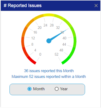
For every SMS implementation, the accountable executive is responsible for ensuring the SMS is working properly across the entire organization. A chart, such as the one to the right, provides managers with a quick glimpse as to whether sufficient safety reporting activity is occurring. If not, the accountable executive should be asking
- "why is safety reporting so low" or
- "what is happening in the SMS?"
Take a look at the chart on the right. What can you see? Are these good numbers? It depends on:
- Size of company;
- Part of the month (first week, or last week of the month?); and
- Recent special events that could affect safety reporting numbers?
Safety Assurance Activities Represented by Safety Reporting Metrics
The aviation safety chart “# Reported Issues” is a great measure of how active an aviation SMS safety reporting culture is for the current month or year. With a dashboard chart similar to the one above, aviation safety management teams can quickly see the total number of reported issues within a selected month or another time period.
The chart from this article comes from an aviation SMS database's dashboard. This chart is one of approximately 45 other dashboard charts that can be configured in SMS Pro. The purpose of the article is not to showcase this particular chart or SMS Pro, but to explain how it works. If you have another SMS database, you can build a similar chart. If you are an SMS Pro user, this article explains the purpose of this dashboard chart.
If done properly, a chart designed like the one above can evaluate the current period with another similarly sized period. If you are building a similar chart, you may wish to include other time periods instead of simply the month or year, as displayed in this safety chart.
Other time periods can be used to display the sum of reported safety issues, such as:
- This week;
- This month;
- This quarter; and
- This year.
Related Aviation SMS Database Articles
- What Is an Aviation Safety Database
- How to Choose the Best Aviation Safety Database Software
- Pros and Cons of In-House SMS Database and Off-the-Shelf-Solutions (COTS)
Purpose of Current Reported Safety Issues Report

As one can easily anticipate, these reported safety issues originate from aviation service providers' safety reporting systems. Such information gives aviation safety management teams the ability to set benchmarks for how many reported issues to expect and set safety goals within a given time period.
Safety managers benefit by comparing the reported number of issues vs goals within that time period and see if the reporting trend in that time period is helping or hurting the overall yearly reporting goals.
Let's take an example of an airline with 500 employees. In our example, we are now approaching the end of the month and have had 36 reported safety issues. The most our company has ever reported within a given month is 52 safety concerns.
For this airline, I can surmise that this company has a healthy reporting culture; however, this month's numbers are low. What is a healthy reporting culture? A good rule of thumb is that for every 100 employees, a healthy reporting culture will have ten reports per month. In the example above, 50 reports is a very good month of safety reporting. 36 reports may be an anomaly that we cannot explain until we have additional information.
Reveal Trends in Aviation SMS Maturity
In the case above, this "number of reported issues chart" sets the highest dial number as the maximum number of reported issues within a selected time period. In our example, we can see that the upper limit of the dial is set to 52, as 52 was the previous maximum number of safety issues reported within a single month.
Representing data this way reveals several things about an aviation SMS' performance:
- If the dial is constantly hitting its maximum displayed limit, then the safety reporting culture is improving;
- If the dial is only mid-range, it could indicate a slowing of safety reporting culture; and
- If the dial is consistently near the maximum, then the safety reporting culture is mature and consistent.
Tracking where this dial consistently is allows emerging aviation SMS to see how well they are achieving their safety goal of continuous improvement. In the same vein, mature SMS can monitor the ongoing consistency of their reporting culture and take necessary actions whenever substandard safety reporting numbers appear.
Related Aviation Safety Chart Articles
- SMS Chart: Where to Focus Hazard Identification Training & Risk Mitigation
- Safety Chart: Overall Performance of Aviation SMS Program
- Safety Chart: Mandatory vs. Voluntary Aviation SMS Issues to Report
What to Watch Out For
The most important negative display safety management teams would remain alert for is reporting numbers that fall far below the maximum number for any selected period. Such a display should raise some rather important questions from senior management, like:
- Why have safety reporting numbers decreased so much from their apex?
- What recent changes in the aviation SMS would warrant this change?
- When did we last conduct hazard identification training?
Of course, sometimes there may be good answers for changes or decreased numbers, but regardless, it warrants further investigation.
Safety managers must also be alert for other anomalies. Data may be skewed due to events, such as:
- Importing legacy data and not adjusting dates properly;
- Effective, but short-lived safety promotion campaigns;
- Recent accidents that increase safety awareness; or
- Recent managerial reprisals against employees, such as implementing draconian policies in response to a reported safety issue.
Where Does This Chart’s Data Come From?
This data, which is stored in an aviation safety database program, will always be filtered by the number of reported safety issues whose reported date falls within the user-specified time period (start date and end date). The aviation SMS software will automatically display the number based on the user's selected configuration.
For manual aviation SMS data management strategies, such as those stored in an Excel spreadsheet, managers will simply have to tediously sort and file the reported issue numbers and the highest number of reported issues in that time period. Of course, the report will not be in real-time, which is the advantage of using a professional aviation safety database program.
Related Aviation Safety Chart Articles
- Safety Chart: Learn How Top Reporters Improve Your Aviation Safety Culture
- Safety Chart: Discover Most Relevant Aviation SMS Hazard Issue
- How to Monitor Aviation SMS Responsiveness Using Safety Charts
How Safety Reporting Charts Relate to SMS Requirements

One of the primary responsibilities that aviation SMS oversight agencies put on service providers and carriers is that they demonstrate continuous improvement. Senior management and the safety team must regularly review organizational safety performance in order to monitor performance. Management can then determine whether there is any indication of improvement. When there is no indication of SMS improvement, the accountable executive must direct actions necessary to address the substandard safety performance.
A central piece of demonstrating continuous improvement lies with reporting numbers. Showing the following charted data for hazard reporting fulfills this responsibility:
- Regularly increase the highest number of reported issues within a time period; or
- Are consistently high in relation to the maximum.
It’s this kind of data that becomes the most powerful tool for safety managers to demonstrate SMS effectiveness to:
- Other managers within the company;
- Clients that may require an SMS from your company in order to fulfill contractual obligations; or
- Regulatory auditors.
Without a doubt, this is the kind of data that auditors love to see. Safety reporting numbers indicate whether the company is monitoring operations and remains vigilant for manifesting hazards. The lack of good safety reporting numbers requires that management develop a plan to address the substandard safety reporting activities. What should you look at? I'd focus initially on:
- Safety policy (does it afford employees protection from management);
- Non-punitive reporting policy (do employees believe it? Is it regularly communicated in safety promotion activities?);
- Hazard identification training (when was the last time training was provided?);
- Safety culture survey (what do employees feel about the SMS and their role in the SMS?); and
- Safety promotion campaigns (why are they not effective?).
Related Aviation Safety Chart Articles
- Aviation Safety Chart: Monitoring Hazard Reporting Culture Per Division
- Safety Chart: Monitor Aviation SMS Performance with Leading Indicators
- Safety Chart: Who (Isn’t) Involved in Your Aviation SMS
Who Should Care About This Chart?
The number of reported safety issues is something that concerns all process owners and senior managers within the company. After all, SMS involves the entire company and not just the safety team. Therefore, the affected parties are common:
- Front-line employees who are actually reporting;
- Line managers evaluating their department's reporting performance;
- Upper-level management in charge of overall performance;
- Accountable executives who are responsible for the SMS; as well as
- Auditors who are tasked with assessing SMS compliance.
The number of reported safety issues is a direct reflection of safety reporting culture – and culture is something that happens at an organization-wide level. If an SMS performance isn't reaching a targeted benchmark, then everyone needs to be aware of how he or she can improve the safety reporting culture. If reporting numbers are good, then everyone should be encouraged to keep up the good work.
Final Thought: Similar Charts

Aviation SMS dashboard charts can display complex ideas using a single chart. Dashboards typically have many related charts to display. One chart by itself may not provide a complete picture of the SMS' performance. Complementary charts help managers see the bigger picture. In SMS Pro, for example, users can drag and drop multiple charts on the screen to create a story that is more representative of SMS activity.
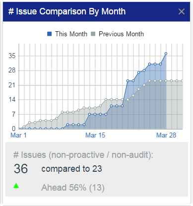
Another aviation safety chart that pairs well with this article's highlighted chart would be an "Issue Comparison By Month" chart or another similar chart that compares the current time period to the previous time period. From the chart at the right, we can see hazard reporting metrics for the current month super-imposed over the previous month's safety reporting activity.
Complementary charts, such as the one at the right, display more specific, incremental representations of reported issue activity.
SMS Pro has several other SMS performance monitoring charts to help safety teams and accountable executives keep on top of the SMS. To learn more about these charts, please watch these short demo videos.
Live SMS Pro Demo
If your SMS needs help to monitor performance, we can help. Sign up for a live SMS Pro demo.
Last updated in October 2025.


