Hazards Are Dynamic

Aviation safety management systems (SMS) have the objective to:
- proactively manage safety,
- identify potential hazards,
- determine risk, and
- implement measures that mitigate the risk.
Furthermore, an aviation SMS affords operators more opportunities to identify safety issues and spot trends before they result in "The Accident."
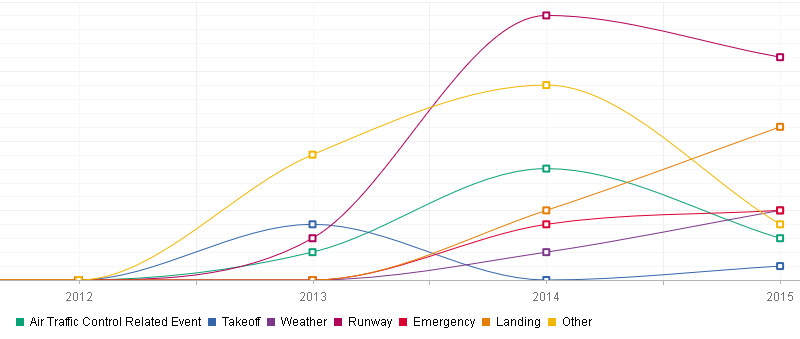
Trending charts can show safety managers the relationship between just about anything they may want to track and are most important for predictive risk management.
Related Aviation SMS Performance Trending Articles
- How to Prepare Data for Trend Analysis in Risk Management Programs
- Six Steps How to Perform Trend Analysis in Aviation SMS
- How to Use Trending Charts in Aviation SMS
SMS trend analysis charts should definitely be every safety manager's best friend.
I love them.
And while most often we think of trending charts as a relationship to some Y variable over time, where they really become handy is in their ability to track the relationship between multiple Y variables over time.
The basis for any trending chart is a question that begins with something like:
- I wonder why this happens?
- I wonder if this is because of that?
- Is this getting any better?
- What is happening that I may not be aware of?
- Is this happening to us again after we thought it was fixed?
The truth is that almost 100% of hazards and accidents are in relation to something else. Bird strikes the weather. Human error to hours worked. And so on. Issues should therefore always be looked at in terms of how they relate to something else - they're dynamic. The list of combinations is literally endless, though with an issue there are usually several most relevant options.
Simply looking at trending charts for a single variable is used to see its general trend. But that’s face value. Trending charts are a more useful SMS tool than that. Mapping a variable against another relevant issue(s) puts that trend in context.
1 – Primary Reasons for Using Trending Charts
No, seeing whether something is getting better or worse is not the primary reason. It’s a side effect.
Rather, the very best reason to use trending charts is:
- Looking for root causes
Trending charts allow safety managers to create a hierarchy of which particular parts of his/her organization influence issues/hazards the most. In other words, root causes. Using trending charts will illuminate the areas in your workplace that you need to focus on the most. Here's a great example of actual aviation safety trending charts.
Related Root Cause Articles
- Is Root Cause Analysis Proactive or Reactive?
- How to Conduct Root Cause Analysis in SMS
- 3 Methods for Root Cause Analysis in SMS
2 – Second Reason for Using Trending Charts
You could even call this a second primary reason. But the ability to take a variable and test it against many other factors allows a safety manager to:
- Extract the most value out of each issue/hazard
Issues and hazards are not static – they are dynamic, changing, and relational. Trending charts prove this.
Example: maybe an organization struggles with a high percentage of unsatisfied employees. A trending chart could help clarify whether that issue is particular to one shift, division/department, a recent development, etc.
3 – Why You Should Map Multiple Variables
An aviation SMS program is a highly structured system. Each of its many parts and pieces, such as employees, management, technologies, environment, and so on, work together to create a certain level of safety.
Within an organization's various parts exist its issues and hazards. The issues and hazards are likewise not isolated at all. Risk impact trending charts prove this by:
- Establishing relationships
Knowing the relationship between aviation safety statistics is an important way for an aviation safety manager to understand the structure of his/her SMS program.
4 – Good Default Variables to Map Against

If you don’t have a particular question to answer with trending charts, the only one you are left with is: “Where do I start?”
Several useful areas to map against and generate ideas are:
- Time of day
- Hours worked
- Weather conditions
Such variables are fairly general but can be a very telling stat as to when/why accidents occur.
5 – Another Reason Why Surveys Matter
I have spoken in the past about the importance of frequent surveys, one of the primary benefits being that you get quantifiable data about employees and the safety culture over time. As in, you can map it on a trending chart.
You probably see where I am going with this.
Curious about whether your hazard reporting culture is improving? Create a trending chart for employee satisfaction vs. a number of reported issues over time.
Curious whether employee satisfaction makes for a safer environment? Map a trending chart for employee satisfaction vs. a number of high-risk issues.
I’ve only used employee satisfaction as an example, but the possibilities here are very deep. You can map almost any safety data against the data that you have collected from your surveys.
Talk about a great way to analyze human factors and safety culture in your organization.
Related Articles on Aviation Safety Culture
- Indicators of Good Hazard Reporting Culture
- Essential KPIs for Poor Hazard Reporting Cultures in Aviation SMS - With Free KPI Resources
- 6 Signs of a Mature Aviation Safety Culture
6 – Variations of One Variable

A rather creative way that I have seen trending charts used is to map variations of a single variable against itself. It’s incredibly useful for making sense of one variable – that is, for extracting the highest value out of a variable.
One great example would be bird strikes. To make sense of your bird strikes variable, you could map the bird strikes by species over time.
You will probably see right away a relationship between:
- Total bird strikes as being primarily one type of bird
- Or bird strikes species varying greatly in different times of the year
Mapping variations of the same variable allows you to dig into the data and get more accurate relationships between it and other variables.
Final Thought – Types of Chart to Use
One could argue that line charts are really the most accurate depictions of risk impact data – there’s a reason why the stock market uses them.
It’s easier to take in large volumes of information with them, as opposed to say bar graphs, or tables. Imagine how much easier the FAA's statistics pages would be to make sense of if they used line graphs. They can also hold many different types of information over a long period of time, which something like a pie chart can’t.
Also with line charts, it’s possible to create more complex representations of data by utilizing both the left and right Y-axis (left side and right side of graph), as well as the top and the bottom X-axis.
Long story short, line charts are versatile and powerful and can make the most out of your risk-impact trending charts.
Getting the most out of trending charts is how safety managers make their aviation SMS more predictive, more proactive, and safer.
Using commercially available SMS database software to generate trending charts leaves the safety team with more time to focus on other tasks, such as:
- Safety newsletters;
- Safety surveys;
- SMS training.
When safety teams spend too much time collecting data and detecting trends, your aviation operation is unnecessarily exposed to additional risk. An SMS database solution really pays off and allows safety teams to really focus on reducing risk to ALARP.
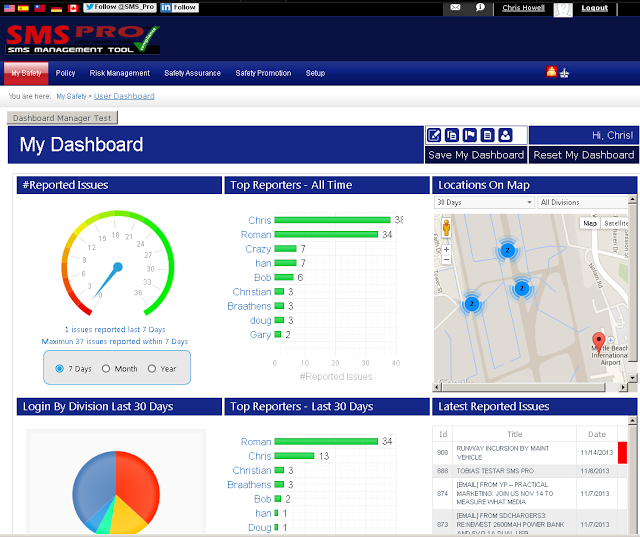
Below are some short demo videos of a popular SMS database. Please watch them to determine whether your company can benefit from an improved SMS data management strategy.
Live SMS Pro Demo
Have questions or want to see SMS Pro live? Sign up for a demo.
Last updated March 2025.


