Aviation SMS Dashboard Charts Monitor SMS Performance

Operators implementing aviation safety management systems (SMS) have common questions early in their SMS implementation. How do I monitor risk to my organization within a particular time period? What report best explains the organization's interactions with:
- operational safety hazards; and
- ineffective risk controls?
What would be a convenient method to display aggregated risk based on assessed safety reports?
How are safety managers at your organization performing risk assessments? Are they consistent? Can they be justified?
Are safety managers tending to under-assess risk priority? Or are they leaning more toward the other extreme and assessing everything as very high risk?
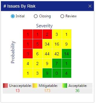
The heat map at the right will be our discussion in this article. There are lots of ideas and concepts behind this chart and we'll discuss its uses and benefits to your organization.
Related Aviation SMS Risk Monitoring Chart Articles
- SMS Chart: Where to Focus Hazard Identification Training & Risk Mitigation
- How to Use Safety Charts to Focus Hazard Risk Management Efforts - Aviation SMS
- How to Monitor Aviation Safety Reporting Culture Using Safety Charts
Displays SMS Performance

The aviation safety chart "# Issues by Risk" is an important chart that safety managers and accountable executives should periodically review to monitor the overall performance of their implemented SMS.
Furthermore, this chart indicates:
- safety team's risk management style; and
- safety reporting culture.
A chart with the number of reported safety issues such as this serves as a "heat map" representation of an organization’s safety risk matrix, which:
- Visually presents aggregated risk priority of safety issues by their calculated risk indices (probability and severity);
- Organizes aggregated risk priority into “Acceptable,” “Mitigable,” and “Unacceptable” levels of risk; and
- Shows the total number of safety issues assessed according to a particular risk index.
Above is an example chart that your aviation SMS database program should provide. Aviation SMS Risk Matrices commonly work by presenting:
- The probability on the Y-axis – the probability moves from the bottom (low probability) to the top (high probability) of the matrix; and
- The severity on the X-axis – severity moves from the right (not severe) to the left (very severe) of the matrix.
The lower the probability and severity, the more acceptable and “lower organizational risk” belongs to the reported safety issue. The higher the severity and probability, the less acceptable the issue and the higher the organizational risk. Obviously, issues that are more severe will and should require greater attention and higher priority than more acceptable, lower-risk issues.
Occasionally, we see risk matrices that have their axes reversed. Regardless of how you configure your risk matrix, this report adds value. When we discuss how to build this performance monitoring chart, we may not bring this topic up again.
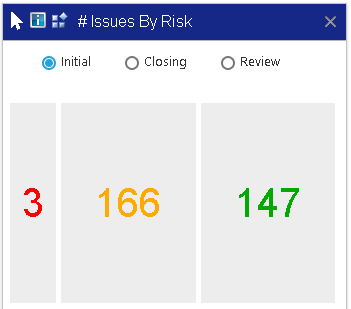
Another uncommon trend is to include "exposure" to generate a three-dimensional risk assessment. In these cases, the final chart will appear without the risk matrix in SMS Pro. I'm uncertain how other SMS database software programs display the three-dimensional heat map

Exposure is a calculation of probability *severity* exposure
The image at the right shows a replacement heat map for operators using the "exposure" dimension in their risk assessments. Since the first two dimensions can be graphed to a risk matrix, the final "exposure" dimension adds a display challenge. The challenge is a technological challenge of not easily displaying the third dimension.
"# Issues by Risk" chart gives aviation safety managers an ongoing view of their safety issue performance over the entire course of their aviation risk management efforts. A pro tip would be to set a date range on the chart, and then compare "heat maps" across multiple periods.
Related Aviation SMS Risk Monitoring Chart Articles
- Safety Chart: Monitor Aviation SMS Contributing Factors
- How to Monitor Aviation SMS Performance - Safety Chart
- Safety Chart: Bureaucratic Weakness in Your Aviation SMS
Reveals the Quality of Aviation Risk Management Efforts
This risk assessment historical chart displays safety issues over the entire lifetime of the SMS implementation (or defined time periods). In this case, the safety chart is part of a performance monitoring dashboard. Most of the charts can be filtered by date ranges. This is a very useful feature as it allows comparisons across different time periods.
Aviation safety managers can interpret the findings to see:
- Volume of their SMS' safety reporting culture;
- Overall success of how well the SMS has avoided high-risk hazards;
- Success of hazard identification training; or
- How poorly their safety reporting culture really is.
For example, aviation SMS should have safety goals and objectives for safety reporting metrics. Being able to see the number of reported issues over the lifespan of an SMS should give safety managers an idea of whether their program has historically been poor, average, or exceeding expectations in terms of total safety reporting volume.
More important is the distribution of the severity and probability of reported safety issues. An aviation SMS risk matrix should have a distribution of:
- Mostly green (acceptable) safety issues;
- Some yellow (acceptable with mitigation) safety issues; and
- Few red (unacceptable) safety issues.
Newer, more reactive SMS implementations will probably see a greater distribution fall into the yellow and red zone, but mature SMS implementations in phase 4 or those that are fully implemented should see a majority in the green zone. If a majority are in the green zone, then the predictive risk management efforts of the organization are ensuring that the reported safety issues are identified early enough to not represent significant organizational risk.
To this effect, "# Issues by Risk" chart shows how mature the SMS is based on the distribution of the severity/risk of issues.
Things to Watch Out For
At any point in time, a static thing to watch out for is too many issues in the yellow and red areas of the risk matrix.
Over time, a dynamic visual cue that safety managers can monitor is:
- Increasingly “acceptable” distribution that indicates more proactive reporting;
- A distribution that is not increasingly acceptable which indicates that the SMS' proactive/predictive risk management is not improving; and
- A higher fluctuation of mitigable and unacceptable issues which indicates a decline in risk management performance.
It might be helpful for aviation safety managers to log the number of acceptable, mitigable, and unacceptable issues on a weekly basis so that over time they will be able to see how reporting culture and proactive risk management are improving. SMS Pro users can use this chart in tandem with the Risk Exposure chart, which automatically performs this task.
Related Aviation SMS Risk Monitoring Chart Articles
- Safety Chart: Prioritize Critically Overdue Tasks in Aviation SMS
- Safety Chart: Are Your Aviation SMS' Procedures Effective?
- Safety Chart: Risk Level Breakdown in Aviation SMS
Where This Safety Data Comes From

During the hazard identification and safety reporting process, employees will report safety hazards that are subsequently risk assessed by safety managers or department heads. Assessing risk early in the risk management process allows a logical prioritizing of the safety issue.
Some aviation SMS database software will usually give issue reporters the ability to provide an informal risk assessment during the reporting process. This should not be considered a valid, document-worthy risk assessment. The purpose is to gather the reporter's sense of the severity that may not, otherwise be captured by a written account.
Only safety professionals who have been trained in the organization's risk management processes should be performing the formal risk assessments to prioritize risk. Otherwise, an aggregated heat map such as this report loses credibility when there are no consistent processes in place to conduct the risk assessment. To add more to this, there should be a limit as to how many people engage in the risk assessment process. Again, this is to increase validity and consistent risk assessments over prolonged reporting periods.
During formal risk assessments, safety management teams will review the safety report's details and conduct an independent risk assessment based on the established methodology documented in the SMS manual.
Assessing risks happens early on in the risk management process. The initial risk assessment allows management to determine how much time is available to treat the safety report per documented risk management processes. This allows for logical prioritization of the safety issue. After an issue has been assessed, aviation SMS software would ideally have the capability to then filter issues based on where they fall into the Risk Matrix and display the results.
During subsequent risk management and investigation processes, the risk severity may change one or more times. For example, there may be at least three times when reported safety issues are risk assessed:
- Initial risk assessment to prioritize the safety issue;
- Closing risk assessment after all mitigation strategies have been implemented; and
- Review risk assessment in the future to ensure risk mitigation remains effective six months to a year after closing safety issues.
In SMS Pro, there is an additional risk assessment phase, and it is simply called "re-assessment." Re-assessment is a logical risk management strategy that documents a "correction" in initial risk assessments. Instead of deleting the initial risk assessment whenever new, relevant information enters the system that would warrant a re-assessment, safety managers would simply re-assess the risk.
There is a benefit of re-assessing a safety issue versus simply deleting the initial assessment. In the real world, new information comes to us all the time. We make decisions based on the available information we have at the time of the initial risk assessment.
Risk assessments are guides.
Risk assessments are your safety tools to use.
There is no written rule stating that risk assessments have to be perfect. After all, most risk assessments have a very high degree of subjectivity in the decision-making process of which risk index to choose. Re-assessing the safety issue allows auditors and managers alike to see the "real story" behind the risk management activities surrounding a safety issue. As long as you can show an auditor or manager the path to managing risk, then all should be well. That is the beauty of having an SMS database that easily documents and stores risk assessment history.
Related Aviation SMS Database Software Articles
- How to Choose the Best Aviation Safety Database Software
- Pros and Cons of In-House SMS Database and Off-the-Shelf-Solutions (COTS)
- How to Choose Aviation SMS Software - Educating SMS Professionals
How Safety Chart Addresses SMS Requirements

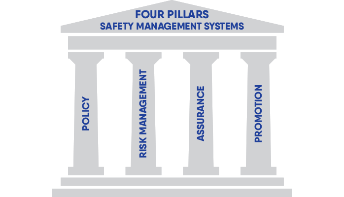
The # Issues by Risk chart is extremely important for an aviation SMS in terms of the following pillars of aviation SMS:
- Safety Risk Management; and
- Safety Assurance.
Most directly, this chart relates to compliance and safety topics around Safety Risk Management as it supports hazard identification, safety risk analysis, and subsequent hazard risk management process.
Also, it reveals certain Safety Assurance aspects of an SMS because it helps safety managers evaluate the historical performance of their risk management efforts.
The two most notable safety assurance monitoring activities are:
- safety reporting; and
- audits, inspections, and evaluations.
Toxic safety cultures will not have healthy safety reporting numbers. This will indicate that an SMS requires more ground-work, either in:
- Safety policy area; or
- Safety promotion efforts.
Who Should Care About This Chart

For the most part, this chart is the primary concern of safety managers who are creating and overseeing the risk management strategy and the ongoing performance of their SMS implementation.
Indirectly, this chart is a reflection of how well employees are able to proactively and predictively identify certain operational hazards.
With the right risk management strategy and risk management tools, employees have every reason to practice proactive hazard identification. If management feels that they do have the right strategy, and yet unacceptable and mitigable safety issues continue to pour into the safety reporting system disproportionate to low-risk safety issues, then SMS reporting culture requires further investigation.
Accountable executives also find value in this chart as it offers pure transparency in their aviation SMS. A trained observer could also draw inferences as to the risk management style of the safety team by their propensity to risk assess safety issues in a particular pattern.
Related Aviation SMS Risk Monitoring Chart Articles
- Safety Chart: Monitor Aviation SMS Performance With Leading Indicators
- Safety Chart: Discover Most Relevant Aviation SMS Hazard Issue
- Safety Chart: Who (Isn’t) Involved in Your Aviation SMS
Final Thought: Similar Charts
One chart that compliments this chart extremely well is its sister chart, the "# Unclosed Issues by Risk", which shows a Risk Matrix of only the unclosed issues based on their Risk Matrix classification. This chart gives safety managers a real-time risk management prioritization schedule.
The charts highlighted in this article belong to an SMS performance monitoring dashboard. There are approximately 45 different charts that users can select to populate their personal dashboards. We show you these charts because our competitors have also been putting them into their SMS database offerings. Feel free to use our ideas.
Good luck with your SMS implementation.
Need Help with Your Safety Program?
Are you using Excel? In Europe, EASA regulation 376/2014 requires that aviation safety reports are to be stored in a database. MS Excel is not a database.
Learn whether SMS Pro is a good fit for you. These short demo videos cover the breadth of this low-cost, commercially available SMS database. Since 2007, we have been providing SMS databases to aviation service providers. Learn why this has been called the best.
Live SMS Pro Demo
Have questions? Would you like to see these SMS performance monitoring charts live? Sign up for a live demo.
Last updated April 2025.


