Importance of Risk Level Breakdown in Aviation SMS

Simple safety charts often speak volumes.
A group of simple, yet related, safety charts evolves nicely into a performance monitoring dashboard. For aviation service providers, a secure, easily accessible dashboard allows management to remain updated as to the performance of their aviation safety management system (SMS).
A simple risk management chart embedded within a dashboard may communicate many things, including:
- Your aviation SMS' real-time performance;
- Whether or not safety issues are consistent with risk management goals; and
- Indirectly, whether risk controls are effective or declining in effectiveness.
Related Articles on Aviation SMS Dashboard Charts
- Safety Chart: How to Monitor Overall Risk Exposure of Aviation SMS
- Safety Chart: Safety Issues by Location - Aviation SMS
- SMS Chart: Where to Focus Hazard Identification Training & Risk Mitigation
The # Issues By Risk Level performance monitoring chart (at the right) is a very straightforward, simple chart, but despite its simple nature, this chart is useful and can be quite revealing if we transpose this information into a Bowtie.
Basically, what this chart shows is a pie chart version of the risk level from all reported safety issues as they undergo your SMS' documented risk management processes.

If you have no reported safety issues, does this mean you operate in an environment without risk? Hardly.
In short, when aviation safety managers work with poor hazard reporting cultures or the manager's lack of effective means to perform risk assessments, this valuable chart will not be within their grasp. This is a performance monitoring chart that gives managers a very quick determination of their safety performance based on their size and SMS maturity level.
As one can easily surmise, a larger organization will have higher safety reporting metrics. A high-performance safety reporting culture will generate ten safety reports monthly for every 100 employees. The more safety reports that are submitted by employees and other SMS stakeholders, the more reports can be fed through the risk management process.
In a short period, very small companies may not find much value in a chart like this because their safety reporting volume doesn't generate enough data to offer much decision-making value. However, as years pass, the historical data should be sufficient to provide value.
In our current example above, 25 of our reported safety issues have received a high-risk level, 319 a mitigated risk level, and 89 an acceptable risk level. You are probably well familiar with the fact that high risk is a combination of high likelihood and major impact (financial and safety) of an event. Lower risk, acceptable reported safety issues will possess a combination of low probability and less severe consequences.
Risk level is an extremely important part of aviation risk management principles and should be carefully considered. However, don't fall into the "paralysis by analysis" phenomenon where you spend inordinate amounts of time performing risk assessments.

What Our Aviation Risk Management Chart Reveals
Let’s consider several things that this performance monitoring chart reveals about your aviation SMS risk management performance.
The first and most obvious is this: the less severe the risk your company faces (i.e. more acceptable = green) the better the safety results your company enjoys. It’s that simple. When we consider the # Issues By Risk Level chart in this manner, we get a pretty good idea of the overall safety performance of our aviation SMS. In our current example, we have a significant (about 75%) number of our reported safety issues that are assessed for medium risk level.
This is far from great, and you would ideally see a chart that looks just like our example chart BUT with the green and orange colors flipped. That is to say:
- Mostly acceptable issues;
- Some medium risk issues; and
- Only a sliver of high-risk issues.
Related Articles on Aviation SMS Dashboard Charts
- Safety Chart: How Effective Is Hazard Identification Training in Aviation SMS?
- Safety Chart: How to Track Safety Reporting Performance in Aviation SMS
- Safety Chart: How to Discover Most Common Safety Issue in Aviation SMS
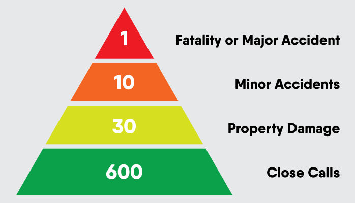
You may even see the Heinrich law displayed in your SMS' safety reporting data. For those unfamiliar with "Heinrich's Law," Heinrich was an industrial scientist who in the 1930s claimed that for every major accident, there were 600 minor incidents and close calls that shared the same root causes. This does not mean that you have 600 chances to perfect your risk management processes before experiencing a major event. The major event may be the first event, the 50th event, or the 600th event. Regardless of which event is the major event, the study suggests that safety professionals should encourage employees to submit every close call and a minor incident for management to have the opportunity to mitigate the risk before "The Accident" occurs.
Obviously, the ideal scenario is more attainable in more mature aviation SMS implementations. Regardless, you could compare this pie chart against safety goals. What goals do you have for a percentage of low-risk issues?
You must never forget this chart is representative of your safety culture. When employees neglect to report seemingly minor accidents, incidents, or irregularities, your company may be at risk for a major event that could have been avoided. In short, encourage employees to report everything and let the safety professionals determine whether it is important.

Insight Into Aviation Risk Management Controls
Finally, and most significantly, this chart reveals where your SMS risk controls are and are not working. Let’s consider the above pie chart in terms of the safety management Bowtie.

With a Bowtie, low-risk issues indicate that risk controls are effectively catching issues early on (before the event). That is to say, your risk controls are for the most part functioning at preventative and detective levels.
Mitigate issues are issues that reach or nearly reach the event stage but were mitigated successfully so that consequences were minimized. What this means is that your risk controls are failing early detection (not proactive), and issues are reaching the event stage before risk controls are effectively addressing the triggering condition.
Unacceptable (red) issues indicate that the event has or is close to having serious impacts on your organization and that your risk controls failed to proactively detect and mitigate an event.

When you take your pie chart and map it onto a Bowtie, you will see where your risk controls are most active. In our example pie chart from above:
- 75% of the potential issues are reaching the event stage – this is far from ideal; but
- Fortunately, very few of those Event issues have severe consequences.
What both pieces of information tell us is that our preventative risk controls need quite a bit of work, but that our mitigation risk controls are functioning well.
Related Articles on Aviation SMS Dashboard Charts
- Safety Chart: Learn How Top Reporters Improve Your Aviation Safety Culture
- Safety Chart: Monitor Aviation SMS Performance With Leading Indicators
- Safety Chart: Monitoring Hazard Reporting Culture Per Division
Where Does This Risk Management Chart Come From?
The raw data is created during the risk assessment stage of your SMS' reactive risk management processes. Safety Managers will give an initial and closing risk assessment for each reported safety issue that passes through your SMS processes. The closing risk assessment is the “final word” on the overall risk a safety issue poses after corrective and preventive actions have been implemented.
As each safety issue is assessed for risk, your aviation SMS database will automatically track the number of low, medium, and high-risk safety issues, and create a pie chart of them based on a selected date range. Alternatively, in manual systems such as Excel, there are many readily available tools for creating pie charts such as this simply by working some filtering magic, and manually entering the number of safety issues associated with each risk level.

Garbage in Garbage Out in Aviation Risk Management Solutions
Automated, real-time charts are very cool and offer considerable value when you have a healthy reporting culture and proper tools to manage and track corrective actions and preventive actions.
When employees are not engaged in hazard reporting for your company, one must look at these charts with a suspicious eye. A surprisingly high number of companies have an SMS only because it is required. If this is your company, don't fret. You should focus more on safety promotion activities and work to change your safety reporting culture. In certain cases, you may want to monitor employee safety performance.
Before you go to extremes and start monitoring employee behavior, please review your safety policy statement and the non-punitive reporting policy. These two documents are critical in reducing friction with employees regarding safety reporting. Furthermore, the message should be promoted regularly to encourage safety reporting.
To get an additional grasp on performance in your aviation SMS, check out the Employee Safety Performance Monitor below.

Last updated April 2026.