Monitor SMS Performance in Real Time

Safety teams and the accountable executive are expected to regularly review the performance of their implemented aviation safety management system (SMS). A regular review of the SMS is important to ensure that any substandard safety performance is addressed in a timely fashion.
Most aviation service providers are storing their SMS data in SMS databases. An SMS database provides the accountable executive with an efficient way to monitor SMS performance in real time. Otherwise, safety data will be in spreadsheets and paper that are not readily accessible to senior management. Consequently, senior management has little assurance that safety issues are being addressed according to policy.
Related Articles on Aviation SMS Performance Monitoring
- How to Monitor Aviation SMS Responsiveness Using Safety Charts
- How to Monitor Aviation Safety Reporting Culture Using Safety Charts
- SMS Chart: Monitor Aviation SMS Safety Performance by Department
When safety managers leave the company with bitter, resentful feelings, a spreadsheet SMS becomes a liability. More than once, I have heard of safety managers taking all SMS data on their personal laptops when they leave the company, thereby leaving the company in a tough predicament.
An SMS database provides the accountable executive assurance that SMS documentation requirements can be satisfied efficiently. Furthermore, the SMS database also allows management to:
- review safety performance reports in real-time using performance monitoring dashboards;
- notify management of overdue safety tasks;
- monitor and track trends across the entire scope of the SMS;
- evaluate safety culture; and
- collaborate on SMS tasks wherever employees have Internet access.
Interactive Safety Charts Facilitate SMS Performance Monitoring
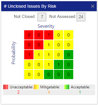
Safety charts easily communicate complex workflows and concepts. For example, the chart at the right is titled "Number of Unclosed Issues by Risk." A manager could have this same data presented in a table or another chart. However, this chart displays what is important to management at a particular time.
An SMS database may contain hundreds of tables and thousands of data points. This is obviously not useful by itself. Reports that condense information assist management in decision-making processes by reducing the clutter and allowing management to focus on only one particularly important concept. In the case of this chart, we are seeing a number of open safety issues based on risk priority.
The chart at the right is small. But it contains considerable information that management can draw inferences regarding:
- organizational safety performance;
- management's priorities to treating safety concerns;
- employee's hazard identification and safety reporting activities; and
- safety teams' perception of risk associated with current safety events.
Related Aviation Safety Chart Articles
- Safety Chart: Track Your Aviation SMS Implementation
- Safety Chart: Overall Performance of Aviation SMS
- Safety Chart: Monitor Aviation SMS Performance With Leading Indicators
Importance of # Unclosed Issues by Risk Chart

The aviation safety chart "# Unclosed Issues by Risk" is an important chart that safety managers use to keep an eye on daily risk management activities. This chart is a heat map illustrating current, in-progress, risk management activities versus historical activity.
From my perspective, this chart should also be one of the first that accountable executives and operational department heads review whenever logging into the safety database program.
This chart represents an organization’s safety risk matrix. A risk matrix is a safety tool that helps management determine and communicate the risk priority of reported safety issues. There are two dimensions or indexes:
- probability; and
- severity.
When safety managers evaluate risk priority, they determine:
- how often would a similar event occur within our organization or the industry; and
- what would be the severity of the worst possible, but credible risk scenario should this event occur again?
By selecting an intersecting cell from the risk matrix, the safety manager identifies the "risk index" which is simply the risk priority. There are certain times in the risk management process when a risk assessment is necessary:
- Initial risk assessment (when safety issue first enters risk management process);
- Re-assessment (as new information enters the system requiring another evaluation);
- Closing assessment (when the safety issue is closed); and
- Review assessments (performed when management teams review closed issues to ensure treatment remains effective).
"# Unclosed Issues by Risk" chart shows how critical reported safety issues are by their severity/probability – and the number of current (open) issues by:
- Number of open safety issues assessed with a particular risk index within the matrix;
- Total number of open issues by the issue’s priority (where to focus our priorities?).
A risk matrix chart’s safety issues fall into one of three critical priorities:
- Acceptable (green);
- Mitigable (yellow - also know as "Acceptable with Mitigation"); and
- Unacceptable (red).
The lower the probability and severity, the more acceptable and “less risky” the reported safety issue. The higher the severity and probability of assessed safety issues, the greater the organization is exposed to unacceptable risk. Obviously, safety issues possessing greater risk will and should require greater attention and higher priority than more acceptable issues.
For this reason, the # Unclosed Issues by Risk Chart gives aviation safety managers a daily reminder of how they should prioritize their tasks for the most efficient aviation risk management process.
Related Aviation Safety Chart Articles
- Aviation Safety Chart: Monitoring Hazard Reporting Culture Per Division
- Safety Chart: Discover Most Relevant Aviation SMS Hazard Issue
- Safety Chart: Who (Isn’t) Involved in Your Aviation SMS
Not All Aviation Risk Matrices Are Equal
Please don't be concerned that your risk matrix does not look like the illustrated risk matrix. Some companies have different risk matrices, with different colors and dimensions. Common dimensions include:
- 3x3
- 4x4
- 5x5
From my experience with hundreds of companies, the 5x5 ICAO default matrix is the most common. Other risk matrices may have:
- An "exposure" dimension; or
- A unique structure, using the ARMS methodology.
What Does This Safety Heat Map Reveal About Aviation SMS?

This heat map chart only displays safety issues that are currently open and require some type of risk management. There are a couple of important insights we can draw when monitoring an aviation SMS' performance based on how data populates the chart.
One of the insights is dynamic insight. For safety managers who monitor this chart every day, they would focus on the following ideal scenarios:
- Consistency in total reporting numbers by risk priority;
- “Unacceptable” safety issues will be rarely reported; and
- Number of safety issues will lessen as criticality goes down.
If the number of open safety issues is constantly highest on the "Acceptable" end, lower on "Mitigable", and lowest on the “Unacceptable” end, it signals to aviation safety managers that their SMS is efficiently monitoring and managing risks associated with operational safety hazards.
A static insight that this chart demonstrates is a daily “where are we” in terms of the efficacy of organizational risk management processes. If, as in the above example, a safety manager views this chart and sees 2 Unacceptable safety issues, then he/she knows that at the current point in time risk management efforts have escalated to a more critical stage.
On the other hand, if there are no "Unacceptable" or "Mitigable" issues, then safety management can rest assured that they are on top of their risk management efforts and can focus elsewhere, such as on hazard identification training or safety promotion.
Alternatively, safety teams may diagnose a deeper concern. Perhaps they have a poor hazard reporting culture and appropriate steps must be taken. A suggested first step would be to conduct a safety survey or a safety culture survey to anonymously gather feedback about how employees view the SMS.
- Are they apathetic?
- Are they confident they can identify a hazard?
- Are you confident that they will report a safety issue when appropriate?
- Are safety reporting processes easy to understand?
- Do employees believe in the non-punitive reporting policy?
Related Aviation Safety Culture Articles
- 5 Characteristics of Effective Aviation Safety Cultures - With Free Survey
- 3 Reasons Why Aviation Safety Culture Leads Directly to Safety Performance
- 5 Simple Tips to Improve Aviation Safety Reporting Cultures
What to Watch Out For
As said, safety managers obviously want to keep a keen eye out for:
- Daily trends in the chart;
- Current distribution of safety issues by risk priority;
- Any open safety issues in the red zone; and
- No reported safety issues in progress.
Aviation SMS that has developed highly evolved risk management processes will watch for highly consistent risk priority distributions, with a majority of issues being in the green zone.
Less mature risk management programs will look towards improving “risk priority” distribution and stay on top of keeping the total number of open, in-progress safety issues at a consistent level.
Where Heat Map Data Comes From

During the hazard reporting process, employees will report safety hazards, accidents, incidents, and close calls. Depending on the organization's documented risk management processes, these safety "issues" are subsequently risk assessed by:
- safety managers;
- department heads; or
- safety committees.
Aviation safety reporting systems may offer issue reporters the ability to provide an initial risk severity assessment during the reporting process. However, this is a rather informal assessment and is meant to provide an indication of the "immediacy" required to treat the safety concern based on the employee's observations and operational experience. For example, in SMS Pro, reporters can indicate whether they believe a particular safety concern is a high risk, or whether it is low risk, but should be reported anyway.
Above, we mentioned that the highest concentration of reported safety issues should have the "green," acceptable risk priority. This should be a warning sign for safety managers when this phenomenon does not repeat in your SMS.
It is not up to reporters to determine the risk posed by identified hazards. This is reserved for trained safety professionals who have operational expertise within the affected area of operations. Employees must be urged to report all potential safety concerns. Management will determine whether the risk is as low as reasonably practicable and reinforce risk controls when necessary.
During risk assessments, safety management teams will review the details of the reported safety issues and make a formal risk assessment commonly using a risk matrix described above. As mentioned earlier, reporters are seldom qualified to provide an accurate, consistent risk assessment as they are not expected to have been trained in your SMS risk assessment procedures. Therefore, formal risk assessments should remain the province of the safety team.
Assessing risks happens early in the risk management process. This becomes necessary to prioritize the safety issue and alert responsible managers on how much time is available to treat the reported safety issue. The process for treating safety issues will be documented in the SMS manual.
Your SMS manual will indicate how much time is permitted to treat safety issues based on their selected risk priority. For example, your SMS manual may state that "unacceptable," high-priority safety issues must be treated within three days, and "mitigable" safety issues may have 14 days to treat and close.
What happens when safety issues are not closed per policy? There had better be a reason. The reason should be documented so that an SMS auditor will be able to learn why the safety issue was not closed per policy. It is not always a bad thing that safety issues are not closed per policy. There are always going to be those unexpected extenuating circumstances, such as gaining approval from a third party or waiting on a dependent process.
After an issue has been risk assessed, the result will be stored in an SMS database. Aviation SMS software would ideally have the capability to filter open issues based on their assigned risk indices (probability and severity) and display the results. This is how this chart is prepared.
During the lifetime of the reported safety issue's risk management process, identified risk priorities may change one or more times. Quality risk management tools will display these risk assessment changes in real time.
Related Articles on Risk Controls in Aviation SMS
- How to Implement Effective Control Measures
- How to Monitor the Effectiveness of Control Measures
- How to Evaluate and Justify a Risk Control in Aviation SMS
How Does It Relate to SMS Requirements

The # Unclosed Issues by Risk chart is extremely important for an aviation SMS in terms of relating to the following aviation SMS components:
- Safety Risk Management; and
- Safety Assurance.
Most directly, this chart relates to compliance and safety topics around Safety Risk Management as it prioritizes safety managers’ risk management efforts, and supports the hazard analysis and hazard management process.
Yet as discussed, it also reveals certain Safety Assurance aspects of a program because it helps safety managers monitor the performance of their risk management efforts on a daily basis.
Safety assurance activities revolve around monitoring systems involved in production activities. When this chart is empty, one may assume the system is not monitored. This chart alone does not paint a complete picture. Additional information is required to draw a correct conclusion.
How big is the organization? If there are 50 employees or more, one can expect to always see open issues in the risk management queue.
Who Should Care About This Chart?
For the most part, this safety chart is the primary concern of safety managers who are overseeing the risk management processes and the ongoing performance of their SMS.
Indirectly, this chart is also a useful reference for employees outside the safety team, such as department heads, who are managing assigned issues. If the total number of open issues is piling up, or if the “Critical” and/or “Mitigable” issues are not being closed within acceptable time limits, Accountable Executives also need to know that more efficient risk management practices are needed. On the other hand, if issues are being managed in a timely manner, they should continue their hard work.
Related Aviation Risk Management Articles
- How to Practice Reactive, Proactive, and Predictive Risk Management in Aviation SMS
- What Is Reactive Risk Management (Why It’s Essential for Aviation SMS)
- Going From Reactive to Predictive Risk Management in Aviation SMS
Final Thought: Complimentary Charts
One chart that compliments this chart extremely well is its sister chart, the # Issues by Risk, which shows a Risk Matrix of the total (open and closed) issues based on their Risk Matrix classification.
This chart combines nicely because it gives safety managers an ongoing reference point for their open issues. The chart at the right provides a reference to the tendency of safety teams to risk assess safety issues according to their predilection. For example, if there are no safety issues assessed in the red based on five years worth of collected safety data, does this mean that the organization never faced a "high-risk event?" Or does it mean something else.
The complimentary chart at the right should be included in the organization's performance monitoring dashboard for easy reference. What charts do you find valuable in your SMS dashboard? Do you have a favorite? Please tell us about it below.
If you are managing your aviation SMS using Excel, you are living in the stone age. Professional aviation companies should be using professional aviation safety database programs designed to manage the ICAO, FAA, EASA, and Transport Canada regulatory requirements.
If your SMS data management tools do not generate charts such as those highlighted in this article, we can help. You may already have an SMS database. You may have the ability to create similar charts to help management monitor SMS performance. The ideas behind this chart are free to take. We know that our competitors review these charts and use some of these charts in their dashboards. You can do the same, or you can upgrade to SMS Pro.
Below are some short demo videos. This chart is one of approximately 45 charts in SMS Pro's Executive Dashboard. There are links to other charts in this article.
Live SMS Pro Demo
Do you have questions? Do you like what you see? Do we seem like a good fit? Want to see SMS Pro live? Sign up for a live demo.
Last updated July 2025.


