Why Mandatory vs. Voluntary Safety Reporting Chart Is Important

We generally think of aviation safety management system (SMS) charts as being visual representations of various pieces of safety data. This safety data commonly comes from performance-based data or classification-type data.
Performance based data may include:
- How many safety reports were submitted within the past month?
- Percentage of safety reports closed on time;
- Trend comparing a number of safety reports and lost-time accidents.
Related Articles on Aviation SMS Performance Monitoring Charts
- How to Monitor Aviation Safety Reporting Culture Using Safety Charts
- Safety Chart: How to Monitor Aviation Risk Management Priorities Using Heat Maps
- SMS Chart: Where to Focus Hazard Identification Training & Risk Mitigation
Classification-type charts measure the number of documented items entering the SMS. Classification types may include:
- Number of fatigue-related safety events within the past year;
- How many bird strikes per month;
- Number of employee-lost-time events this year.
These two types of safety charts are measuring key data points. These data points typically offer safety management teams decision-making value to monitor operations and make necessary operational adjustments based on identified metrics.
However, charts can be used more creatively. Just ask yourself – What is the point of a safety chart?
What Is the Purpose of Safety Charts in Aviation SMS?

The reason for safety charts is to very quickly communicate a large quantity of complex, but related information – a quantity of data that if read in a data table would take significantly longer to make sense of. Again, most of this data is based on performance data. With this in mind, it becomes obvious that aviation SMS reports can also be used to display other information that would be helpful for employees, but not necessarily based on performance data.
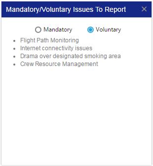
Hence, the "Mandatory/Voluntary Issues to Report" chart. This "chart" is not really a chart, but a short-concise list that has been designed to promote the SMS. More specifically, the list is designed to improve the quality of reported safety issues entering the safety reporting system.
To be effective, a chart does not have to be complicated. Furthermore, there is no reason that a "safety promotion" chart cannot be sitting next to performance monitoring charts in an SMS' dashboard.
The chart at the right is not complicated - in fact, it’s about as simple as it gets.
Simply a bullet list of:
- Issues that your organization requires to be reported if identified in your working environment; and
- Issues that someone may want to report, but certainly aren’t required to.
The primary reason that this chart is important is that in a mature aviation SMS, a company may have hundreds – and maybe even thousands – of different types of safety issues that could potentially affect operations. These safety issues will stem from multiple causes and systems, including:
- Human Factors related concerns;
- Communication issues;
- Training, or lack of training; or
- Particular operational issues.
Related Articles on Aviation SMS Performance Monitoring Charts
- Safety Chart: How to Monitor Aviation SMS' Policies and Procedures?
- Safety Chart: How to Track Safety Reporting Performance in Aviation SMS
- How to Monitor Aviation SMS Responsiveness Using Safety Charts
Using Safety Charts to Promote Safety Reporting Activity
Not all operators have the same priorities.
Not all operators experience the same hazards. And to take this one step further, not all employees have the same priorities. Not all employees have had the same experiences or educational training. The purpose of this chart is to communicate management's key focal points to all employees. What are management's pain points? What do we need to be alert for this month or year? This chart increases awareness of particular types of operations or employee activities.
As a safety professional, your duties include promoting the SMS and ensuring the organization engages in healthy hazard identification activities. This safety promotion chart does exactly this. This chart communicates your organizational requirements for mandatory reportable safety issues that must be sent to the regulatory agency.
Yet this chart goes beyond mandatory reports and allows management to focus organizational efforts on employees to report safety issues. This focused attention helps keep risk management activities relevant and efficient. A great feature of this risk management chart is that it lives in an SMS performance monitoring dashboard. Dashboards capture the attention of management and employees alike. The dashboard becomes a tool to not only monitor SMS performance but also to promote the SMS to focus hazard identification activities.
Situations When This Chart Is Very Useful

If you use this chart (or something similar) you will quickly find it to be extremely useful to prevent and aid in certain scenarios. Just consider the following:
- Your safety reporting system is continually bogged down with very minor, irrelevant, and not valid issues. If this problem is rampant, then much of your risk management activity is spent addressing issues that don’t improve organizational safety. In other words, waste of time. This chart should act as an easy, quick guide for employees who are unsure of which types of operational issues they should remain vigilant to report;
- Employees who are new to your company or new to SMS will find this chart a valuable reference for knowing when/what to report; and
- The fact is that the average employee is only reporting a handful of times each year, and this chart may help stimulate the safety reporting culture by making certain issues obviously mandatory.
In many ways, this chart will be a simple but effective tool in creating the kind of SMS hazard reporting culture you want in your organization – whether that means:
- seeing less of certain types of issues reported,
- collecting more desirable types of reported safety issues, or
- helping new employees get up to speed quickly.
Related Articles on Aviation SMS Performance Monitoring Charts
- Safety Chart: How to Monitor Overall Risk Exposure of Aviation SMS
- Safety Chart: Monitor Aviation SMS Performance With Leading Indicators
- Safety Chart: Visually Presenting Aviation SMS KPIs - With Free KPI Resources
What This Chart Reveals About Your Aviation SMS Implementation
Simply put, the list of "Mandatory/Voluntary Issues to Report" reveals what kinds of safety issues your company values most. While there will obviously be similarities between different companies’ charts, each company will feature a unique set of mandatory and voluntary safety issues to report.
The best case usage of this chart would be to list compliance-related safety issues as well as KPI-related issues. Depending on the type of safety issue you are promoting, the safety team will have to determine whether each entry is a:
- Mandatory reportable safety issue; or
- Voluntary issue.
How Mandatory/Voluntary Reportable Requirements Charts Are Created
This chart is extremely easy to create. It simply involves:
- Having management create a list of types of issues that it values most highly (mandatory reportable);
- Deciding which other common safety issues that employees might wonder about should be included on a voluntary reporting list; and
- Then organize each list into easy-to-read, bullet point format.
When publishing the list, don't use long phrases in your descriptors. This chart should be immediately useful by taking a quick glance to refresh one's memory. The longer and more complicated the text is for each type of desired safety report, then the less chance that an employee will review it and remember the entry. Keep it simple.
If you need inspiration, then I would start with a list of safety issues required by the civil aviation authority. The next logical data source to investigate would be the:
- Hazard register; and
- List of safety goals and objectives.
And that’s it. This chart could be created after one or two safety meetings.
How This Chart Relates to SMS Requirements
In many ways, this chart is a very abbreviated form of different parts of your safety policy. Instead of requiring employees to slog through your policies and expect them to remember what is mandatory and what isn’t, you can cut out all the extra verbiage and give them what is most important.
In this respect, this chart demonstrates a willingness on your part to clarify reporting culture goals and improve the safety culture in your organization.
Related Articles on Aviation SMS Performance Monitoring Charts
- Safety Chart: Prioritize Critically Overdue Tasks in Aviation SMS
- Safety Chart: Bureaucratic Weakness in Your Aviation SMS
- Safety Chart: Monitor Aviation SMS Contributing Factors
Final Thought: Who Should Care About This Chart?
This chart will prove very useful for line-level employees. For this reason, they should care about any tool that helps make their job easier or their responsibilities clearer.
Management should also care about this chart for two reasons:
- Clarify issues that are most important to the company; and
- Promote the type of safety reporting culture that is best for the company.
There are many ways that aviation SMS software can improve your safety culture and benefit your organization.
Here are some short, but useful demo videos that you can use to compare your SMS program and learn which elements your current system may be lacking to achieve total regulatory compliance.
Last updated January 2026.


