What Is Safety Performance Monitoring in Aviation SMS

Safety performance monitoring in aviation SMS is the primary way you will assess your safety program. This assessment happens in two different ways:
- Passively, such as in the case of high, system-level performance monitoring, such as trend identification; and
- Actively, such as in the case of daily performance monitoring of safety issues, including their associated hazards, risks, and control measures identified during issue management.
So, when we talk about “safety performance monitoring,” we need to always specify whether we are talking about passive or active performance monitoring if the context is not clear.
Whether active or passive, performance monitoring is always based on data. Data can be analyzed and compared in different ways to produce different views of safety performance. To do this, you will need different types of data analysis tools. You will be able to see these data analysis tools in action at the end of this article.
Related Aviation SMS Performance Monitoring Articles
- How to Monitor the Effectiveness of Control Measures
- Best Tip for Aviation Safety Assurance Monitoring
- How to Be Compliant With ICAO Safety Performance Monitoring and Measurement
Using Multiple Safety Performance Tools for Accuracy and Dependability
Having one tool for safety performance monitoring will always produce biased and unreliable results. Conclusions of safety performance should only be drawn after assessing your SMS from multiple angles, and multiple types of data.
The tools listed in this article are not meant to be all-encompassing. By this, we mean that other charts and tools can supplement or replace those listed below. We want to provide some inspiration, i.e., samples so your safety team can either develop these tools or purchase full-featured, low-cost SMS database software that allows you to easily monitor your aviation SMS.
If you are using paper and MS Excel to monitor safety performance, you will have a more difficult time monitoring safety activities, including demonstrating continuous improvement.
Effective aviation SMS performance monitoring will be painful unless you can sustainably access data and subsequent charts that pull safety performance data. If you don't have access to good SMS database tools, you should consider including SMS tools in your budget.
Poor Safety Cultures With Skewed Safety Performance Data
A commercially developed SMS database is only effective if your safety culture accepts new technology. If there is too much resistance to the SMS, or if you don't have top management support, then I recommend focusing on safety culture. If this sounds like your company, then don't fret. The full-featured SMS databases also have tools to enhance your safety culture, such as:
- Electronic safety message boards;
- Safety surveys;
- Safety Newsletters; and
- Safety training tools.
Organizations with poor safety cultures do not typically capture all relevant safety data. Consequently, data captured to monitor the progress of the SMS will be incomplete and suspect. As safety cultures improve, hazard reporting increases, and safety teams and upper management can be assured data is not as skewed as before.
SMS software tools are not expensive. The best SMS databases are
- user-friendly,
- configurable,
- secure,
- full featured for a complete SMS, and
- easily accessed using modern web-based technologies.
Related Aviation SMS Database Articles
- How to Choose the Best Aviation Safety Database Software
- How European Operators Know They Need Aviation Safety Management Systems (SMS) Database
- See How Spreadsheet Not EASA Compliant Aviation Hazard Reporting Database
These following examples can be created or easily adopted at your company. You may call them something different. Please review these tools (using the accompanying link in each section) thoroughly to ensure you understand the purpose and benefits of these types of tools. Again, these are examples of leading the discussion and are by no means the complete list of safety performance tools.
1 – Risk Analysis Charts
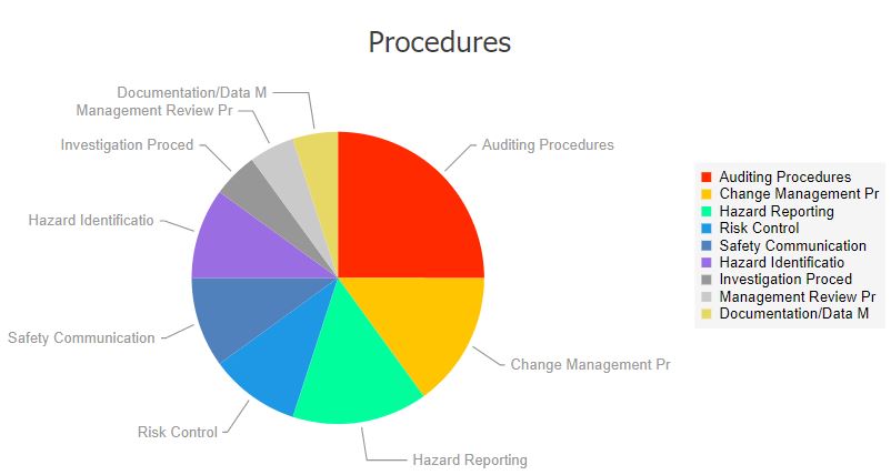
Risk analysis charts are probably the most common, passive performance monitoring tool. They are not meant to communicate complex data. Rather, they are best used to provide:
- Quick glance at many different types of data (such as hazard classifications, type of issue classifications, etc.);
- Easy way to compare active safety issues’ data against passive, general, organizational performance;
- Inspiration for safety management teams to focus risk management efforts;
- Different ways to view the same data, such as with pie charts, line graphs, etc.; and
- A very useful visual tool for SMS reports and safety newsletters.
Risk analysis charts are the kind of chart that should probably be consulted on a daily basis. They may be grouped together for convenience in a performance monitoring dashboard that includes other safety performance charts. You might have around 10 charts for:

- Safety-financial data;
- Hazard classifications;
- Issues by location;
- Issues by department;
- Root cause classifications;
- Type of issue classifications;
- And so on.
Risk analysis charts are best created in an integrated aviation SMS database, whereby charts are created automatically, in real-time as data is received. You could create these charts in MS Excel but don't expect to have the time, energy, or data available for continuous performance monitoring.
At best, safety teams without aviation SMS databases will generate these types of safety performance charts on an annual basis. I know a couple of managers who used to spend three weeks each year compiling data and generating reports that could have been generated instantly with a few clicks of the mouse.
A question you should asks is: What is my time worth?
When skilled labor is cheap, upper management may not realize the value of having an SMS database generate these reports instantly. It may be that upper management may not realize how burdensome it is for you to generate these safety performance reports. This is an opportunity to prepare the business case and demonstrate the many benefits of commercially available aviation SMS database software.
2 – KPI Performance Monitor

Whereas risk analysis charts are used to communicate general, organizational-wide data, a KPI performance monitor tool provides an in-depth look at the performance of your organization's most important safety goals and objectives. Remember that key performance indicators (KPIs):
- Each represent one of your safety objectives;
- Communicate the performance of your safety goals; and
- Allow you to visualize the more important elements of your SMS program.
A KPI performance monitor will show you only data related to your key performance indicators. It will allow you to be apprised of:
- Negative trends in KPIs;
- Satisfaction and non-satisfaction of controls related to KPIs; and
- Safety objectives that are/aren’t being met.
A KPI performance monitor should be reviewed on a weekly or monthly basis. Your review interval is dependent on the volume of:
- Safety issues coming into your hazard reporting system; or
- Audit findings and concerns generated by completed audits (if you have an integrated audit program in your SMS database);
A word of caution here. You will need an easy way to create and manage your key performance indicators. The aviation industry operates in an open system; therefore, the operating environment is constantly changing. Expect your KPIs to also change as your SMS matures or the operating environment changes.
Being able to quickly spot trends reduces organizational risk and allows safety teams to develop corrective risk management strategies to mitigate risk in a more timely fashion.
Related Key Performance Indicator Monitoring Articles
- How to Automate Key Performance Indicator KPI Monitoring the Easy Way
- What Are Best Practices for Key Performance Indicators in Aviation SMS
- How to Set Up and Monitor Key Performance Indicators (KPIs) in Existing SMS
3 – Data Analysis Tool for Data Mining

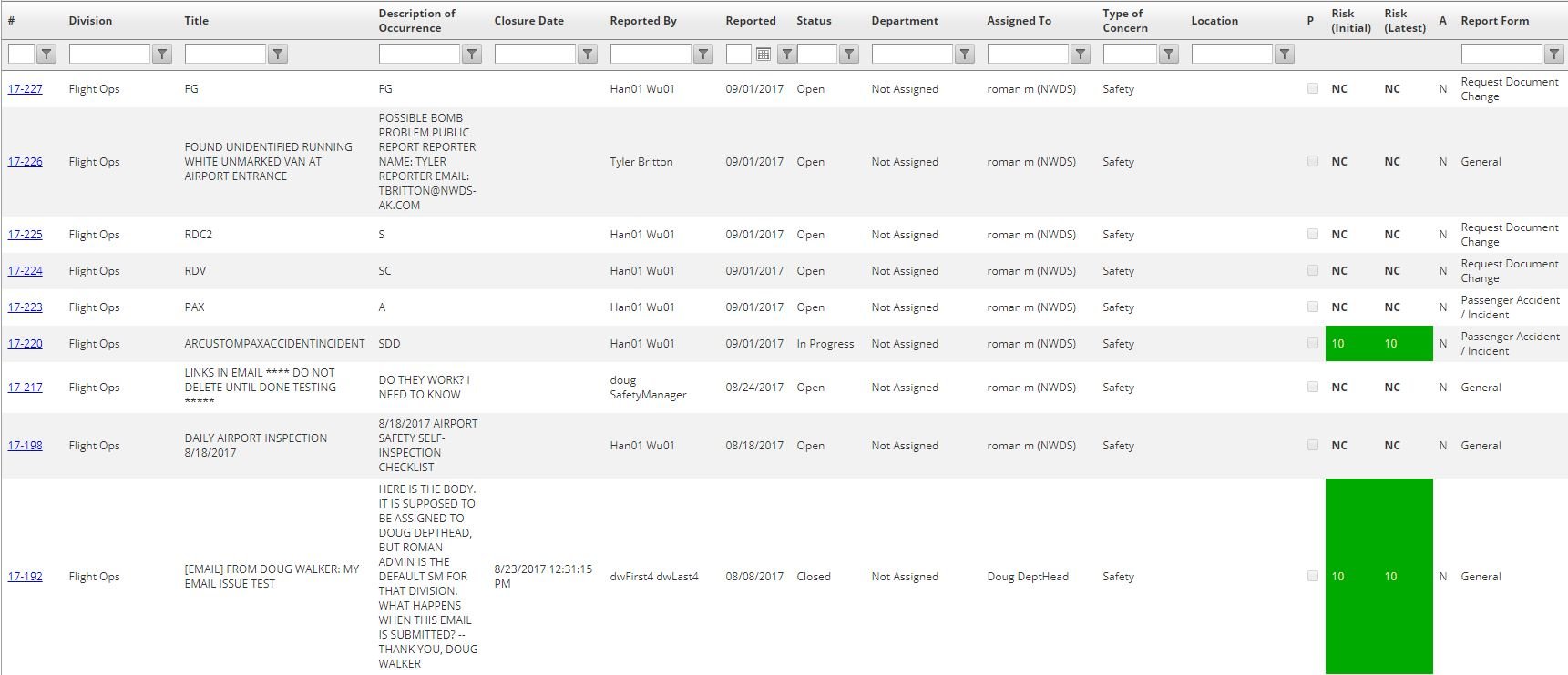
Data analysis tools are indispensable for seeking out the finer elements, mechanisms, and relationships that drive safety performance in your aviation SMS. A data analysis tool provides you secure access to large chunks of diverse data, whereby you can pull out certain pieces of the data to conclude. These types of reports are commonly investigatory in nature and are considered "one-off" reports, i.e., you don't know what you are looking for specifically.
A data analysis tool is best used to:
- Compare two different pieces of data to find a correlation between them;
- Find a correlation between data and time of day, season, departments, etc.; and
- Find underlying causes of more general data (i.e., risk analysis charts).
Data analysis tools will often be used in response to a specific question, such as:
- What is the relationship between X and Y?
- Is there a root cause reason why X happens?
Data analysis is a specific activity that is not performed regularly but is used as a part of a quarterly or annual review process. Data analysis is an extended activity that can take up to a week of constant data mining.
A data analysis tool will have certain "expected" features that aid in the development of specialized data sets. These features include:
- Sorting by data column;
- Filtering out data based on desired criteria (such as date range, or keyword or phrase);
- Full text search;
- Exporting to MS Excel (to allow for custom charts or further analysis); and
- Grouping by similar data elements.
It goes without saying that you will need access to your SMS database to query your safety data.
4 – Safety Performance Trend Monitoring
Performance trend monitors are a risk management tool that hybridizes risk analysis charts and key performance indicators. Performance monitors are designed to give more complex, specific data metrics than risk analysis. But they are also designed to provide data metrics beyond KPIs.
A primary example of a performance trend monitor is the development of aviation leading indicators. They provide very complex and useful data that are perfect for trending negative and positive elements of the SMS that don’t relate directly to safety objectives.
Reviewing trending charts should be performed on a monthly, quarterly, or annual basis. This will be dependent on the volume of safety data entering your SMS database.
Safety performance trend monitors allow management to view the number of occurrences of particular types of issues over defined time periods. In order to be effective, safety teams must remain diligent in classifying issues appropriately. Trending charts are useful for:
- Identifying past trends to learn from mistakes;
- Uncovering developing trends to immediately apply necessary risk management strategies; or
- Finding holes (blank spots) in your SMS that require more attention.
Related Risk Management Trending Chart Articles
- Six Steps How to Perform Trend Analysis in Aviation SMS
- How to Prepare Data for Trend Analysis in Risk Management Programs
- Aviation Safety Managers' Best Friend - Trending Charts
5 – SMS Dashboard

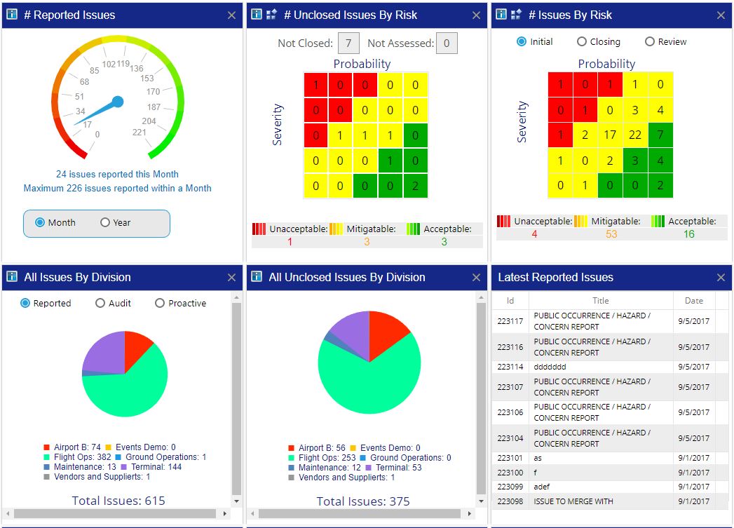
An SMS dashboard is an extremely valuable, everyday tool that will show you any number of useful data elements for monitoring the daily performance of the SMS.
A dashboard should be something you visit at least once per day to stay abreast in real-time of the performance of your SMS. An SMS dashboard is capable of showing you valuable information that you need at a glance, such as:
- Newly reported safety issues;
- Upcoming deadlines for issues and corrective actions;
- Number of reported issues for month;
- Some of the most important risk analysis charts;
- Upcoming training deadlines;
- Safety issues/CPAs assigned to you; and
- Safety promotion information.
An SMS dashboard can communicate this data efficiently, as shown in the example image. An SMS dashboard is wired up to the SMS database. There are a couple of strategies for accessing data to display these charts.
The most common strategy in modern SMS databases is to query the data in real time and create new charts each time a visitor sees the SMS dashboard. Another strategy is to generate the reports on a daily basis and serve "canned charts." In this approach, the dashboard is not displaying SMS data in real time and is subsequently less accurate than real-time reports.
SMS database engineers may choose "canned charts" for performance reasons or to generate PDF report libraries. In my opinion, a well-designed SMS database should be pulling data back in real time. Real-time data analysis minimizes risk and offers upper management assurance that the data is complete and hopefully accurate.
The following videos demonstrate all of these tools in action - used in real aviation SMS programs.
Last updated December 2025.


