What Is Proactive Risk Management

Proactive risk management for safety managers involves risk management activities that are dedicated to recognizing potential concerns before those concerns actualize. Proactive risk management does this by:
- Identifying trends in important safety data; and
- Reviewing risk controls, policies, procedures, and other safety resources for effectiveness.
The important point here is that such trends and effectiveness review identify potential problems before they have a negative impact on the SMS.
For example, consider a situation where management identifies a trend in a particular root cause. So far, this root cause has not caused any significant problems, and upon further investigation, management realizes that there are no risk controls assigned to that root cause.
This example demonstrates the power of charts for proactively identifying potential problems.
Types of Charts That Work Well for Proactive Risk Management
Not all charts work well for proactive risk management. Data displays like tables and pie charts often do not work well for proactive analysis, as such data is usually static. It does not indicate where performance is heading.
Data in the form of trending charts and line charts is usually better suited for proactive analysis. Why? Such data is dynamic. It offers a comparison and point of reference in order to understand where performance is heading. They help you answer three important questions:
- Is management performing?
- Are risk controls working?
- Are safety goals being realized?
Here are 4 charts for proactive risk management.
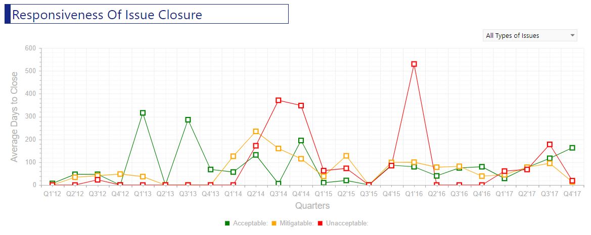
1 - Responsiveness of Issue Closure Trending Chart

Issue responsiveness trending charts are great proactive tools for assessing the direction of performance for managing issues. What this chart shows is:
- Average number of days to close safety issues;
- Issue organized by their initial risk assessment; and
- A time of at least a couple of years (if applicable).
Newer safety programs will probably demonstrate greater time for closing issues, but, ideally, will see those average times drop year over year. Established safety programs need to monitor that safety issues don’t begin to have poor oversight. Poor oversight leads to longer issue closure times, which will negatively impact this trending chart.
Positive indications of trending are:
- Steady fall in the average number of days to close issues; and
- Consistent number of days to close issues.
Negative indications of trending are:
- Steady rise in the number of days to close issues; and
- Sudden spikes in the number of days to close issues.
If negative trends are identified, managers should investigate the cause and correct it before it leads to significant problems.
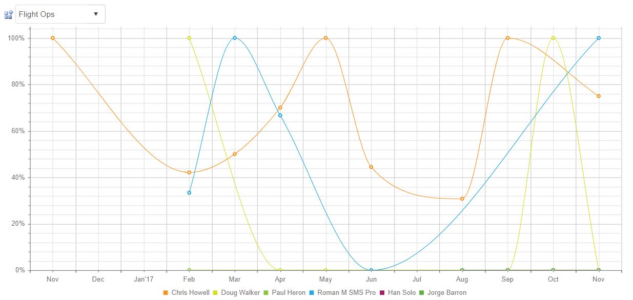
2 - Manager On-Time Issue Closure Performance

Similar to average days to close issues, manager on-time issue performance trending charts are a fantastic proactive tool to monitor safety performance at a very small level. This chart displays:
- Each manager who manages issues;
- Each month that the manager manages issues;
- The percent of issues each manager closed on time, per month.
When issues are consistently closed late, it indicates either:
- Poor management oversight;
- Poor process for managing issues; or
- Poor performance of individual manager(s).
Any three of these points can lead to significant problems in your safety management system. This chart helps you monitor trends in managers’ performance, where you can identify negative trends and address them before they become significant problems.
Related Aviation Risk Management Articles
- What Is the Process of Risk Management in Aviation SMS
- From Reactive to Proactive Risk Management in Aviation SMS
- Proactive Risk Management: What Root Causes Say About Management
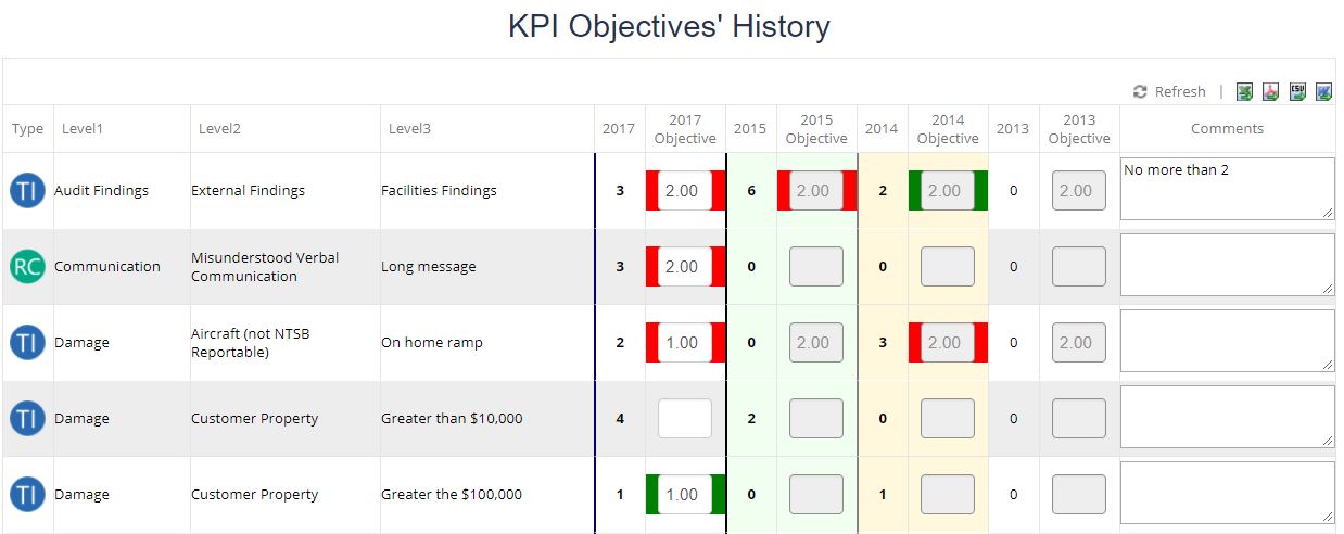
3 - Key Performance Indicator Goal vs. Classifications Table

While tables don’t generally work well for proactive charts, a key performance indicator (KPI) goal vs classification chart is a great proactive tool. This chart shows:
- All of your key performance indicators;
- The number of each KPI has been classified this year; and
- The maximum goal of classifications for each KPI.
When a KPI’s classifications come close to your goal for that classification, it indicates that risk controls relevant to the KPI are not performing as well as they should. You can then proactively investigate the risk control before your KPI falls into non-performance.
4 - Root Cause Classification Trending Chart

Root cause classification trending charts are fairly straightforward charts. They show your top root cause classifications over a period of time. The idea here is that the more a root cause is being classified, the less performant the risk controls assigned to that root cause are.
Trending charts work well for monitoring root causes because as soon as a root cause begins to show indications of being inadequately controlled, you can investigate and implement changes needed to stop the negative trend before it leads to an incident.
Final Thought: Leading Indicator Metrics
Beyond charts, leading indicator metrics are fabulous proactive risk management tools. Aviation leading indicators are comparison metrics that indicate underlying reasons for safety performance. Leading indicators are:
- Precursors that correlate directly to performance;
- Underlying causes for success or failure; and
- Identify warning signs.
For more information about leading indicators, see these free 40 leading indicator charts:
Last updated in December 2025.


