What Is Safety Manager Performance?
Safety manager performance is the ability of safety managers to drive performance in aviation SMS. “Drive performance” can mean either:
- Active improvement in different areas of the SMS;
- Active sustaining of quality performance; and
- Active mitigation of safety issues.
SMS charts are fantastic tools that you can use to monitor the safety performance of management. Not only do they visualize your performance in easily understandable ways, but they give you a comprehensive picture of how you are driving performance in your SMS.
In terms of performance, the three things managers should probably be most concerned with are:
- Efficiency;
- Timeliness; and
- Risk mitigation.
The following six charts help you monitor safety manager performance for all of the above points.
1 - On Time Issue Closure Chart
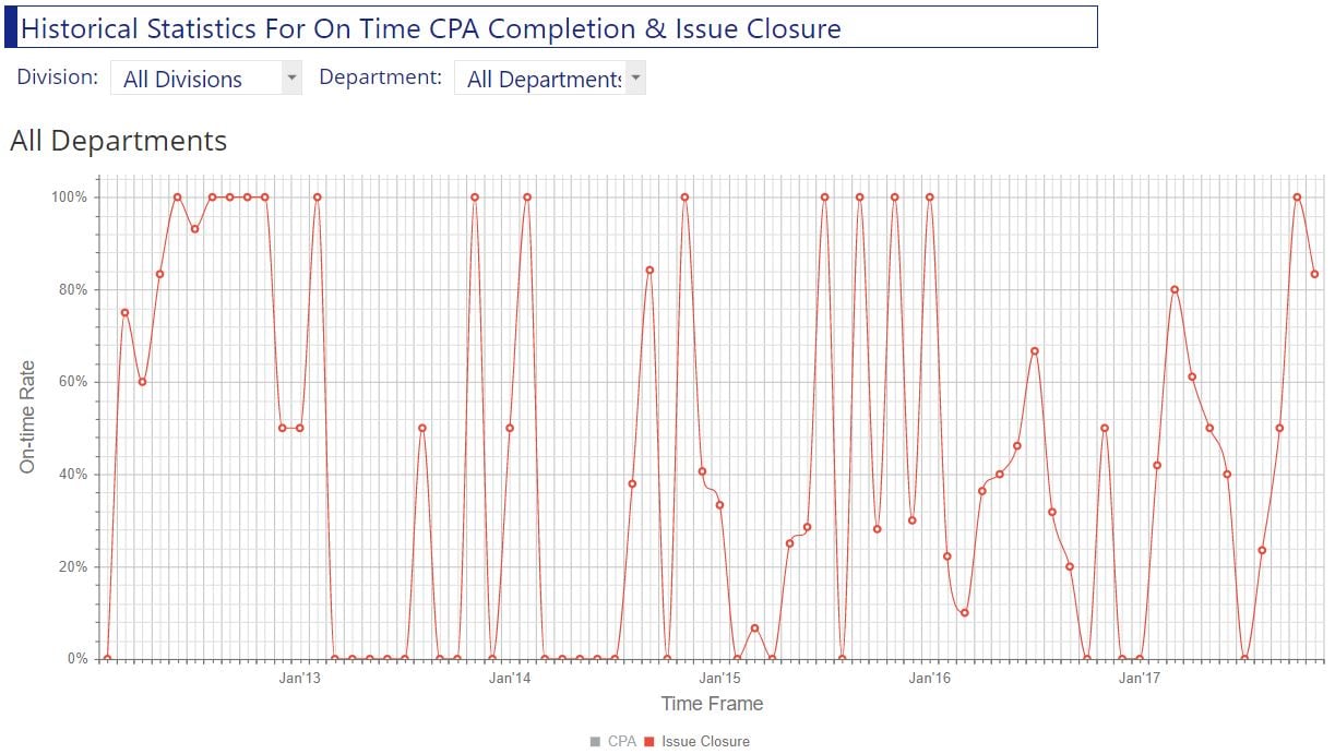
What is an on-time issue closure chart?
- Shows percentage of on-time issues closed;
- Usually shows past year, with percentages organized per month; and
- Can be broken down into on-time issue closures per manager.
What it says about safety manager performance:
- Indicates whether or not managers are hitting target goals (for issue closure);
- Indicates efficiency/organization of management’s issue management process; and
- Indicates how dedicated assigned managers are to the safety program.
What you want to see in this chart:
- Consistent high degree of on-time issue closure; or
- Consistent improvement in the percentage of on-time issue closure, such as from poor to better performance.
2 - On Time Corrective Preventative Action Closure Chart
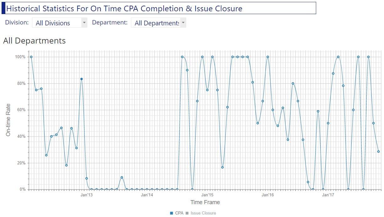
What is an on-time corrective preventative action (CPA) closure chart?
- Shows the percentage of on-time corrective actions that were completed on time;
- Usually shows performance for the past year, organized by month; and
- Is useful to show on the same chart as the on-time issue closure chart.
What it says about safety manager performance:
- How well responsible managers are managing issues;
- Communication and Norms in safety management system; and
- Whether or not responsible managers are hitting target goals outlined by safety managers.
What you want to see in this chart:
- Consistent high degree of on-time issue closure; or
- Consistent improving percentage of on-time issue closure, such as from poor to better performance; and
- Closure rates that are consistent with on-time issue closure.
3 - Average Days to Close Issues Chart
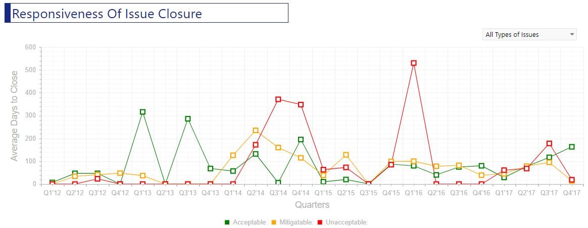
What are the average days to close the issues chart?
- Average number of days to close issues from report date to closure date;
- Shows average closures per month; and
- Organizes issues by their initial risk assessment level.
What it says about safety manager performance:
- How performant safety managers are for implementing change;
- Efficiency of issue management process; and
- Potential indicator of employee resistance to change in the company.
What you want to see in this chart:
- Average on-time issue closure that is consistent with goals and/or safety policies; and
- Gradient in average time based on initial risk assessment (high risk = lowest closure time).
4 - Initial vs Recurring Risk Assessments Table
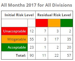
What is an initial vs recurring risk assessment table?
- Shows all issues in a given time frame based on initial risk assessment; and
- For each initial risk assessment level, show the latest recurrent risk assessment levels.
What it says about safety manager performance:
- How effective safety management’s actions are in managing issues for a given time period; and
- Rate of effectiveness vs historical time period.
What you want to see in this chart:
- Very consistent mitigation of initial risk level;
- Initial high-risk issues with nearly all recurrent risk levels at lower level assessments;
- Initial mitigate risk issues with same and lower level assessments; and
- Low-risk level with no higher recurrent risk assessments.
5 - Key Performance Indicators Outside Performance Acceptability Chart
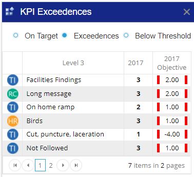
What is a non-performance key performance indicators in chart?
- Shows all key performance indicators;
- Key performance indicators that are beyond goals set for them; and
- Goals are usually classifications but can be other forms of measurement.
What it says about safety manager performance:
- KPIs are the monitored data of your safety objectives;
- KPIs that are not within their KPI goal indicate non-performing safety objectives; and
- Indicates baseline performance for safety management to hit the most important target goals (safety objectives).
What you want to see in this chart:
- Ideally, this chart would be empty!
6- Number of Reported Issues by Risk Level (Over Time) Chart
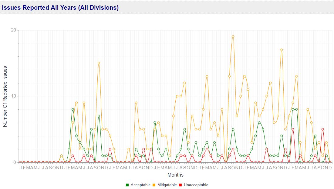
What is the number of reported issues by risk level chart?
- Shows number of reported issues each month;
- Numbers are organized by their initial risk assessment level; and
- Includes all months since the beginning of SMS.
What it says about safety manager performance:
- See performance over entire history of SMS; and
- Shows overall success/failure of mitigation efforts over time.
What you want to see in this chart:
- Steady decrease in high-risk issues over time until they reach a steady level; and
- Increase in low-risk issues over time until they reach a steady level.
The following resources will help you monitor safety performance:
Last updated in October 2025.


